
Mind&Me: A Mental Health App
Creating an all-in-one app for mental health learning and needs
Team
Yeatasmin, Priyanka, Karan, Tharani
Tools:
Figma, Google Suite
Timeline:
16 weeks
Role:
Product Design, User Research + Testing, UI Design, Mobile Prototyping
overview
For this project, the brief was to create a digital product on an interface of our choice with a field in mind. My team and I decided to create a mobile app that focused thoroughly on mental health and learning. Through research, interviews, and user testing, we created a mobile prototype with a flow meant for a new user who wants to access mental health resources and take better care of themselves. Our mission is to offer our target users with a healthcare app that aims to revolutionize mental health management by providing a holistic, user-centered solution.
problem
Individuals facing mental health challenges often struggle to access a streamlined and effective solution for managing their mental well-being, hindering their ability to attain a happier and balanced life
goals
1 Holistic, user centered solution
2 Access to resources
An all-in-one app targeting different aspects of mental health
Understanding and learning about mental health without barriers
the process
users
research
solution
wireframes + user testing
We first conducted a survey with mental health related questions to narrow down our demographic, which garnered 26 respondents and 9 interview participants. We asked questions in the interview related to mental health and their experiences to understand the challenges and behaviors around their personal mental health and of those around them.
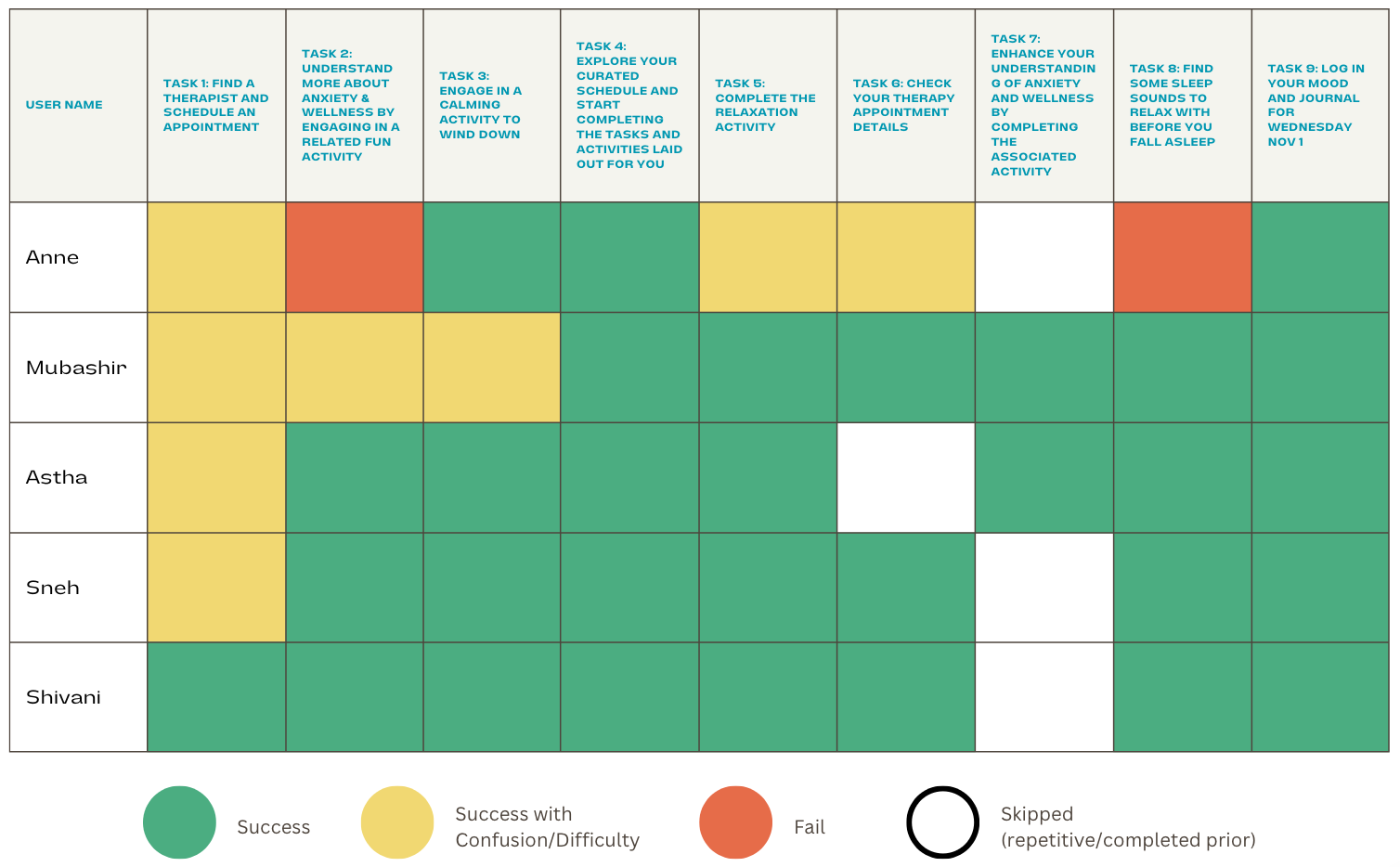
Tracking: Users preferred more manual personalization, and for this feature to be represented as a Home page.
Learn: The activity section was not easily discoverable, and mismatch of contents and quiz choices, created confusion.
Therapy: Users felt it was text heavy, and some users experienced confusion with the flow.
Relax: Meaning of some information was confusing, users expected kind of indication of current activity.
The stoplight chart reflects the level of ease the users experienced when exploring our wireframes. We kept in mind to try and make the start of the journey flow as easy as possible so that there is no difficulty or confusion like there was during the user testing sessions.
1 Therapy and mental health is overwhelming and not accessible
2 Users want to stay informed through accurate and trustworthy resources
3 Users want something more streamlined with mindful practices
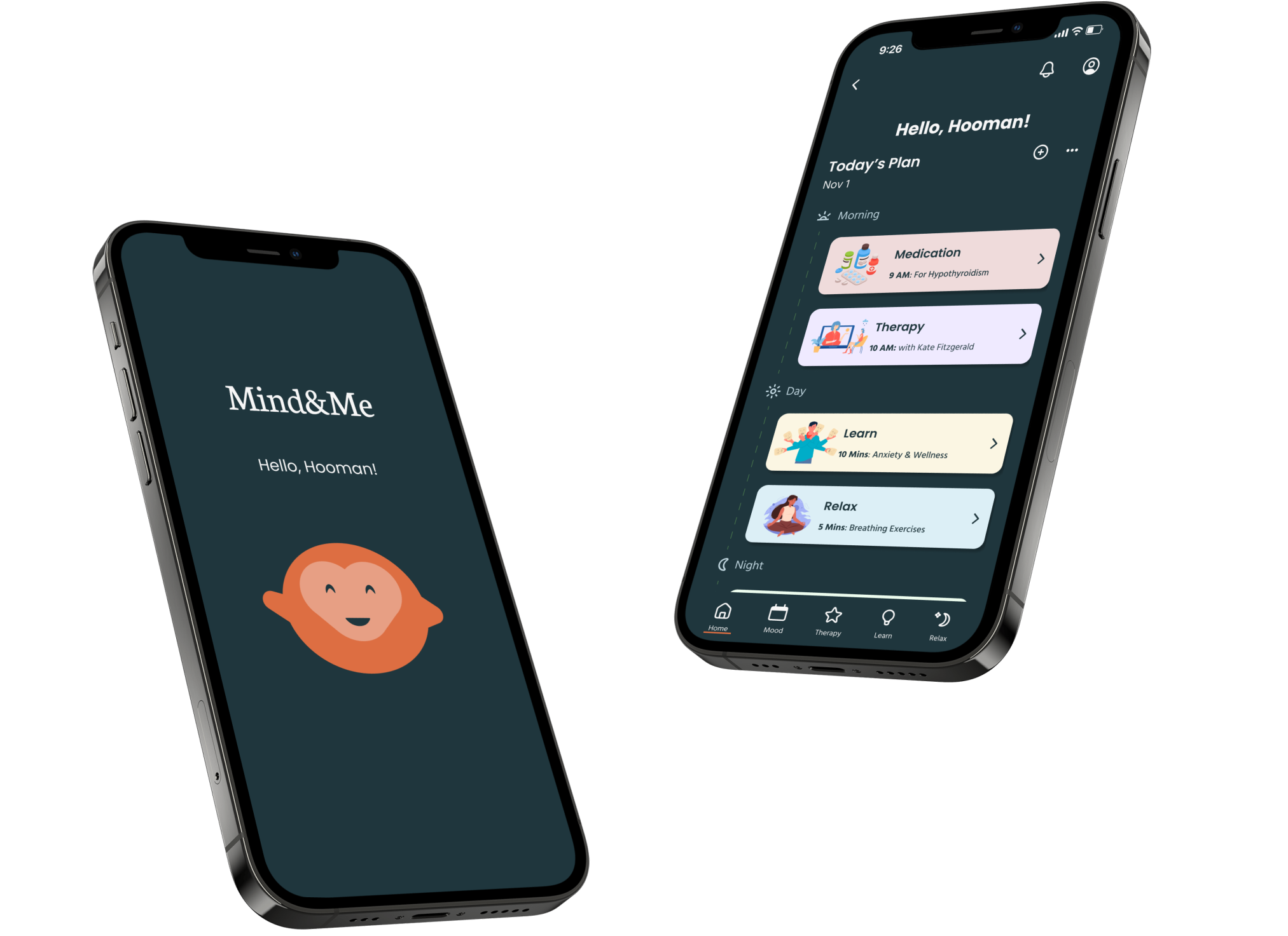
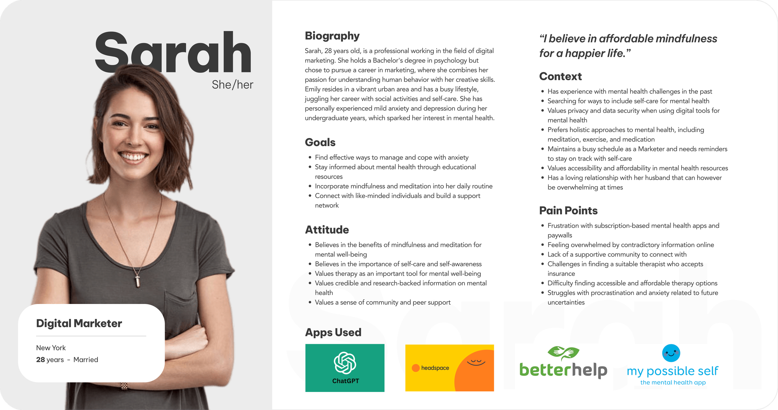
To help people like Sarah, we need to provide all features needed to effectively manage mental health in a single place. This intends to make it easier to discover and access available resources, find the right help catered to each individual and keep track of the help being received. Our focal points are:
Therapy
Mood Tracking
Sleep Tracking
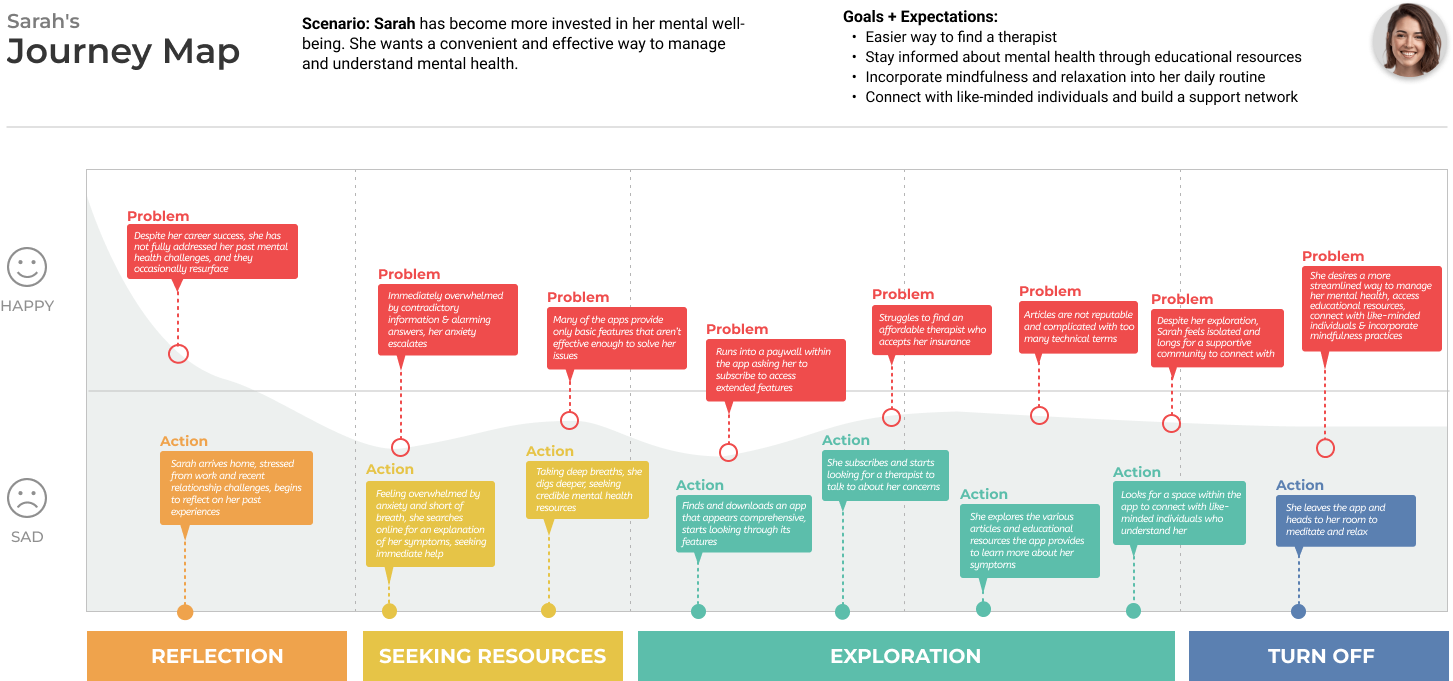
These insights from our research helped us to further understand our target users to form a typical user journey for Sarah.
We organized our interview notes through affinity mapping and conducted further research via competitive analysis, mind mapping, brainstorming, sketching, and mood boarding. We gained the following insights based our research:
How might we provide an enhanced experience for Sarah to improve her mental well-being?
We as a team started on wire framing based on our research which we also tested with the same interviewees.
Initial Wireframes of each focal point
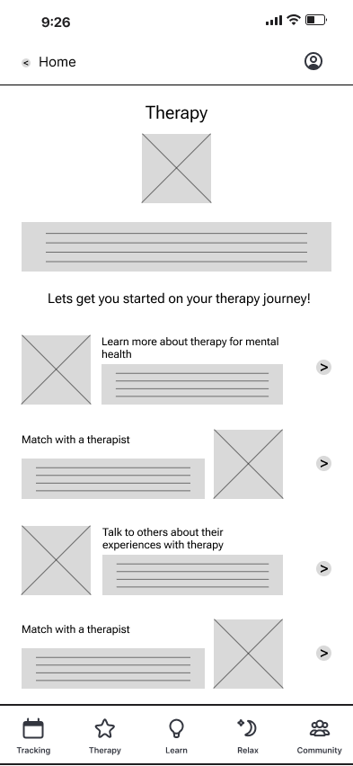
We tested the following features with our wireframes: Effectiveness of the nav bar and its contents, as well as the contents of the curated schedule, and the “Therapy”, “Learn”, and “Relax” features of our app. All features were tested through the “Tracking” feature using the curated schedule process, including the “Mood” feature. These are the insights from the testing that influenced our final design decisions.
92%
survey respondents encountered situations where they felt their mental health was not at it’s best
“I want an app that can cater to individual behaviors and preferences.”
69%
survey respondents are currently seeking mental health
“Explain it to me like I’m a 5-year-old.”
“I want something all-in-one.”
Based on the interviews, we were able to create our persona, Sarah.
Relaxation
Learning
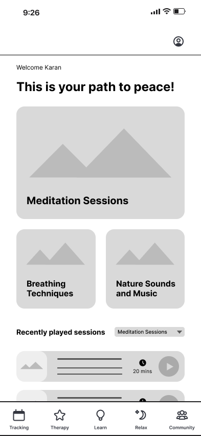
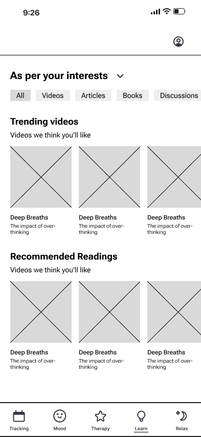
final prototype
Our team worked on creating a cohesive and identifiable brand for our final prototypes. We had some of our participants look at the final product as well and they were able to notice the difference from the wireframes.
“It’s much nicer to look at now that there are fewer buttons here.”
“The flow is much easier to navigate now, and some redundant things have been removed.”
“A very smooth flow, I didn’t have to think about things too much this time.”
Play with the prototype below or click on the buttons to view!
reflection
This project is something that everyone on the team was very passionate about. It was quite difficult at times to stay aligned in terms of design and ideas because we were breaking the work up and everyone has their own style. However, we managed to bring it together for the final product.
If I were to keep working on this project, I’d want to develop the app further to achieve full working functionality in sync with external resources, especially for therapy and educational materials. I’d also want to integrate social features on the app, which would allow for people to interact with like-minded people and receive peer support if they choose.